Toon® Mobile
- ← Previous project
 Overview
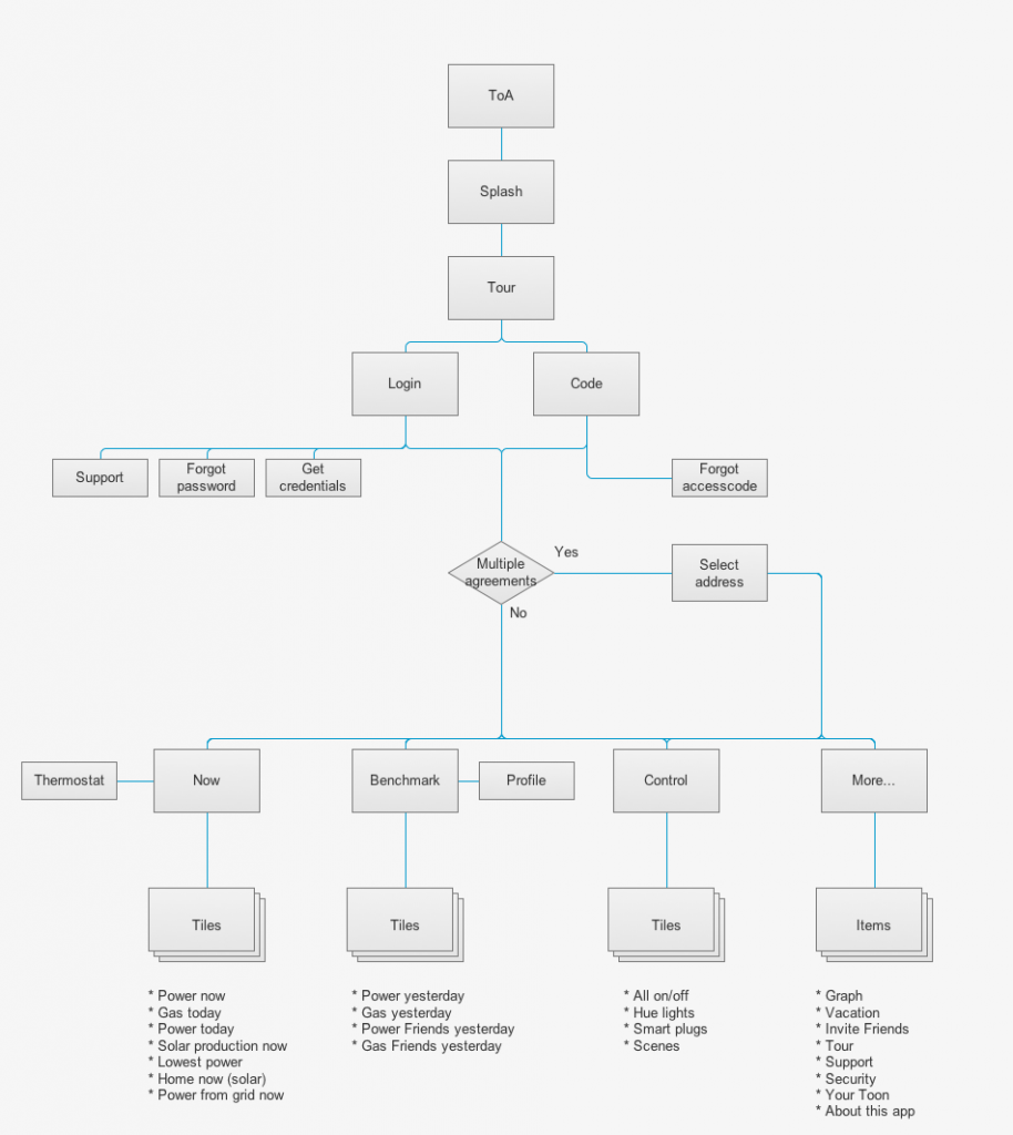
The ‘original’ mobile app for Toon® was designed and launched in 2012. It’s concept was to be a remote control for Toon. It was a successful launch and in 2014 we redesigned the app to fit the new display UI for Toon.
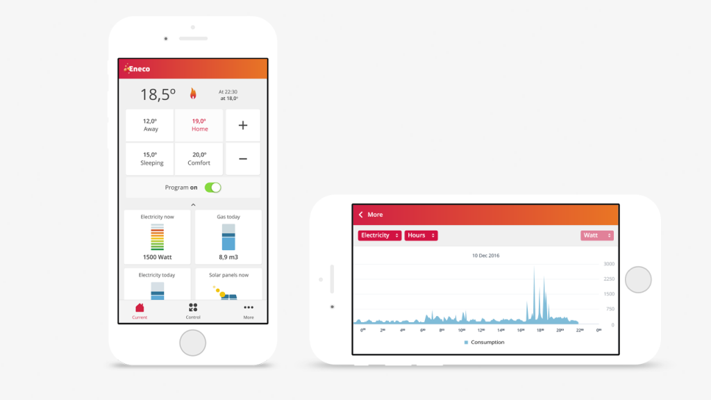
We broadened the concept somewhat: ‘Direct insight and control…everywhere’, which led to a design that combined the thermostat controls with energy insight (an overview of your home and the opportunity to adjust it where needed).
Challenges
The creation of a intuitive and easy combination of the thermostat controls and the energy insight. It’s an information heavy app with lots of monitoring, so it was also a challenge to balance all the information and keep performance as fast as possible.
Solution
Actually putting all information together on the homescreen. It’s not something I’d like to do but in this case it’s perfectly clear you want a ‘house-overview’ in which temperature and energie usage are key. Our approach was ‘overview-first’, then ‘control’, because the overview eventually trigger control (because you don’t like the current temperature setting). By hiding the controls for the thermostat it was possible to give center stage to the insight tiles without losing the temperature information (thus creating a complete overview). By sliding the tiles down you get access to the controls,which gives them presence in the homescreen without sacrificing screen estate (and by that create more focus).
We’ve tested our approach and assumptions by guerrilla testing.
User research
Personas
A/B testing
Redesign
Concepting
Interaction Design
Visual Design

- ← Previous project

